
Ten Great Tips for Putting Together a Poster for a Conference
Actively attending conferences and academic congresses in your field is another great way of disseminating knowledge, meeting people and networking. You usually run into a lot of like-minded people, with similar academic interests and aspirations, and are able to discuss your findings from various perspectives.
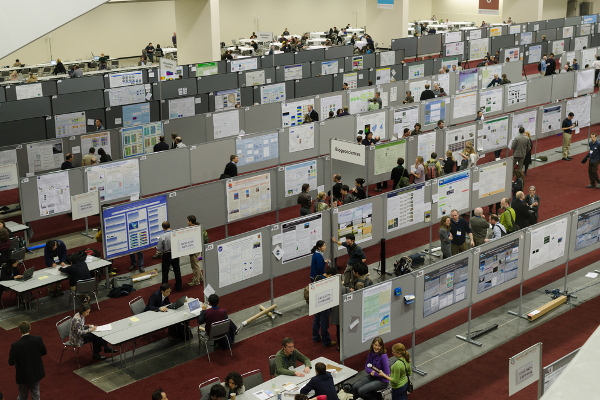
Many people prefer presenting a poster — in contrast to giving an oral presentation — as presenting a poster is considered by some less stressful and more fun than speaking. However, since one of the main purposes of going to a conference is to share your findings and receive feedback, you want to make sure your poster makes an impact and attracts some attention if you go this route.
Here are some tips for designing an impressive academic poster:
- There are usually instructions for authors included in the material sent to those attending and presenting. Read these instructions carefully; they include both the requirements you need to follow when designing the poster (size, fonts, etc.) as well as some useful tips for organizing your poster.
- Don’t make it too wordy. Ideally, it should be no more than 800 words long (but even better to keep it shorter than that). Ideally a person should be able to read it in 5 to 10 minutes. Remember, there will be a sea of posters out there, so you need to be realistic about how much time visitors can spend next to your board. One of the most obvious mistakes is to make your poster cramped and too long, resembling a print out of your original research paper – trust me, not many people are likely to stop and have a 30-minute read.
- When it comes to content, think of your poster as an extended abstract of your study. It should include all the relevant sections of a paper:
- Include some photographs, picture, charts and graphs. These are going to make your poster stand out and attract more people. However, don’t over do it.
- When choosing colors, consider your readers. Don’t make the background dark or black as this will make text difficult to read. The best option is to go for white (this will save you some ink, too). Avoid using red and green next to one another as about 7 to 10 percent of the population has difficulty distinguishing these two colors. To optimize readability, your safest option is dark colors against a light background.
- When designing the poster’s sections, keep it symmetrical; this is more pleasing to the eye. Also, keep some white space between different sections. Most people from the Western hemisphere tend to read from top to bottom, and left to right. You want to follow this pattern when laying out the information (top left to bottom right). To make it easier for the reader, you can number the columns/section and/or add flowchart marks that guide the reader.
- You want your poster to be readable from a distance of at least 5 feet. Unlike scientific papers, avoid Times New Roman as it doesn’t enlarge well. Century Gothic or Avante Garde are good for text. It is advisable not to use more than 3 fonts. Text should be at least 36 points. Title font size should be between 120 to 200 points and subheadings 48 points.
- Include your contact information. You won’t be standing at your poster all the time, so make sure that anyone you miss can contact you later. Also, it is a good idea to have some printouts of your poster handy, so you can give them to anyone interested in your research.
- Be creative, but don’t try to be too “smart” or unusual. It is important to deliver your message clearly and make it easy for the reader to follow.
- Give yourself enough time to experiment with different layouts. Also, get some honest feedback before printing out your final version.
– Title – make it interesting and catchy, so it lures people in. This should be a brief sentence that presents the idea of your research well.
– Introduction – include the purpose and objective of your study (keeping it around 200 words).
– Research methods – keep it short; if people want more details, they will ask.
– Results/findings – focus on these, but keep it simple and memorable; emphasize the things that could stimulate conversation.
– Conclusions – include the takeaways of your study (again, keeping it around 200 words).
– Literature cited – make sure you follow the citation style prescribed by the conference.
You can also include an acknowledgment section where you mention individuals who made contributions, the source of funding, and possible conflict(s) of interest. This part shouldn’t be longer than 40 words. You generally do not include an abstract. As already mentioned, the poster is an abstract in and of itself.
Use these tips and you will have a great experience. For a good poster cheat sheet, have a look at the poster example Colin Purrington provides here.